November 15th, 2011

Operation: Decoration, Part 2

Meeting Izzy

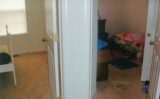
We met with Izzy to find out more about her family, their needs, and to check out the rooms.  Tons of potential, we are so excited. Always love starting a new project.

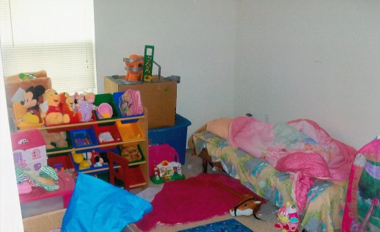
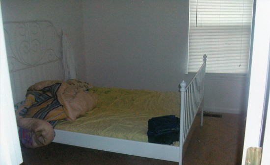
First, a look at the rooms (we will be doing two). We take measurements, start thinking how the girls will use their rooms and what furniture plan would be best, and decide what sort of window treatments make the most sense.

Right now R. is in the room that will become the nursery; it’s about 10 x 11 feet.

R. will move into the existing guest room, which is a bit bigger at about 11×11. Perks of being the big sister.

Next, a conversation to determine what sort of “look and feel” Izzy envisions. This is actually one of the most interesting (and sometimes challenging) parts of being an interior decorator who specializes in children’s spaces. Not only do we need to interpret what the parents’ style is, but we also need to capture the essence of what they believe will appeal to their child. While some clients have torn out pages from magazines and bookmarked design blogs, which of course can be very helpful, what’s really essential is knowing how to ask the right questions. It’s all really very subjective—one person’s light celadon is another person’s chartreuse—so you have to know how to parse answers.

We start by asking about the preschooler R.’s personality. Izzy says, “She’s less ballerina, more stars on the ceiling; more a blue than pink kind of girl, but pink is OK if it’s not ‘too’ pink.” See what I mean about how it can be tricky? But her statements are actually totally helpful. I get it: R. is not a super-girly girl. (And phew, Izzy’s not hoping for a Barbie pink and lavender sparkly princess extravaganza. Not that there is anything wrong with that. Ok, there usually is, but I digress…)

For the baby’s nursery, she says wants something “soft” and “old-fashioned” but also says that she likes the idea of pink and green. Now pink and green is a great color combination, but the pairing is usually done in bolder tones and can trend pretty preppy, not what I’d consider “old-fashioned.” After some more talking I get that by “old-fashioned,” Izzy means a look that’s classic, traditional and sweet. Got it…I already have some fabrics in mind.

Next in Operation: Decoration

We pull together boards and present design concepts.


Share
October 15th, 2011

Introducing “Operation: Decoration”

Belvoir Edition

We are passionate about designing special spaces for babies and kids, but it is especially gratifying to create rooms for young children who face challenges other kids don’t and whose parents can be far away as they work hard to protect America. So we’re kicking off a new series at Finnian’s Moon Interiors — Operation: Decoration. We’ve selected a deserving military family (well, aren’t they all?) living on post at Fort Belvoir, Virginia and we will provide everything needed to make dream bedrooms for their kids — from needs assessment to design concept to furniture, window treatments, decorations  — all at no cost to the family.

Military kids face challenges that other kids don’t. At any time, mom or dad could be deployed for months. And just when they are settling into a new community, it can be time to move again. We’ll keep these challenges in mind as we design. We will suggest as many items as possible that can be easily moved, so that when the family is stationed someplace else, mom and dad can quickly and easily adapt the design to make everyone feel right at home.

Over the next few weeks, we will meet with Izzy, Army wife and mom to preschooler R. Izzy is expecting baby number two in January. Our mission: create rooms for R and her little sister.

We’ll keep you in the loop for the whole process, from the initial consultation where we learn about the family’s needs, to our inspiration, to the selection process to the final install.

Belvoir means “beautiful to see.” We hope that through Operation: Decoration, we will help Izzy’s girls have a beautiful rooms to call their own, wherever dad’s duty takes them.


Next in Operation: Decoration

Our first meeting with Izzy…


Share
October 1st, 2011

Inspiration: The Sock Monkey Series

Too often, people stumble into a baby big box store and think, hmm, ok, character, themes, pink, blue, I guess this is what a kid’s room is supposed to look like. But the truth is that your child’s room can – and should – be so much more. It should be a special place that speaks to home. When designing a nursery, the first thing I ask clients is what they want it to feel like, what is their inspiration?

The other day I came across a sock monkey. Totally cute. Timeless, really.  I thought how such a simple item with universal appeal could be interpreted in so many fun ways. Really, just by changing the fabrics, even within the same color story, you can create a wide range of rooms.  From traditional to modern, from cottage-y to sophisticated, even with the same crib, chair, ottoman and paint colors, by selecting fabrics that speak to you, you capture the essence of your inspiration yet make it totally yours.

Take this cute guy:

With these paints…

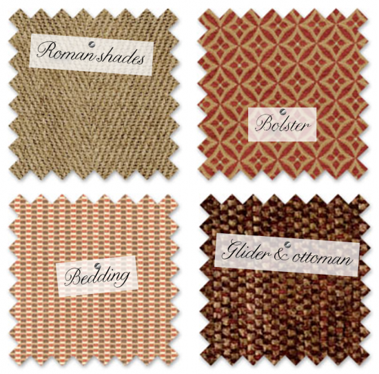
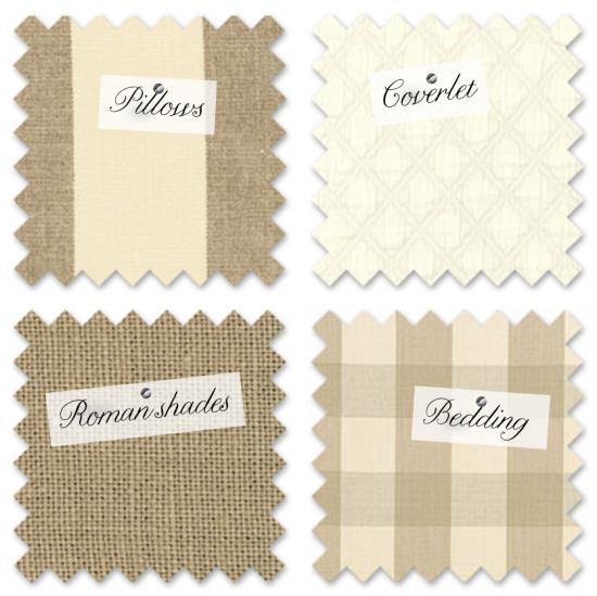
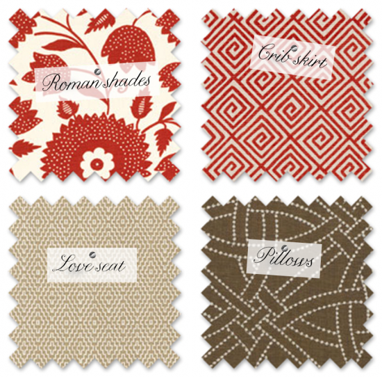
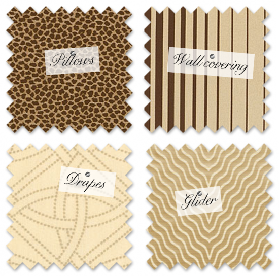
And see what different stories the fabrics evoke:


Traditional boy

I see this in a brick, center-hall colonial with ivy growing on the sides. I love the cozy chenille with the weighty linen.

Neo-trad girl

Love the earthy tones combined with the super-textured fabrics. Animal prints are so fun and really can read as a neutral when balanced with appropriately sized motifs, like the floral here.

Modern preppy

The velvet stripe becomes playful when partnered with the subtle paisley and sophisticated geometric. Something about this set reminds me of like the coolest college dorm ever. Maybe Oxford. Or at least how Hollywood would show it.


Classic calm

So no red here in the fabrics, but don’t forget we have the wall paint for that. This palette would be great for a boy or a girl, or for boy-girl twins.


Modern, Bold Geomterics

I’m in love with this red floral. So crisp and fun, and partnering it with the geometrics keeps it from looking too kitchen-y. I’d keep the walls in the neutral side of the paint palette. Red walls would be way, way too much.


Glam (with an edge)

So not for every client, but for the right house — think Hollywood regency meets industrial chic — these super-statement swatches would be right at home. Again, no red in this  family. The fabrics are enough.


Sophisticated Country

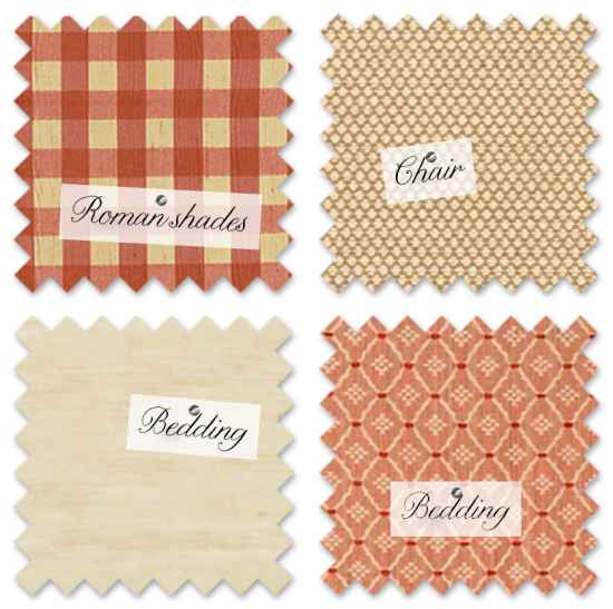
And for the total opposite of the above, this sweet set is timeless. The gingham stays fresh with the strie-like look in the cream linen. I picture a river house. With a sprawling porch. And a tire swing.


Totally fun, huh? Pretty diverse looks for our little sock monkey friend.


What’s inspired you?


Share
September 15th, 2011

Shared spaces: Big brother + baby

With a studio in Old Town, Alexandria, land of charming brick sidewalks lined by narrow, historic row houses, I am often asked by clients how they can make a shared-room situation work. Sometimes it’s twins, but more often it’s designing a room that will work for big brother or sister and new baby. The keys here are planning and palette. Planning because we design the space to work post-crib, and palette because with the right color and fabric choices, mixing a “big boy” bed and crib can work seamlessly.


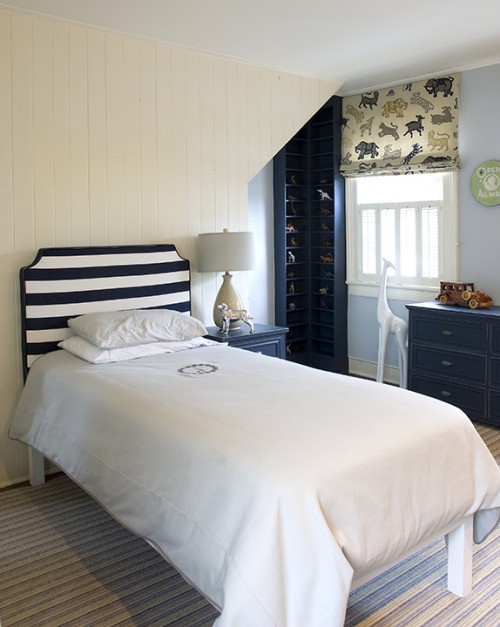
Take a look and J and G’s room:


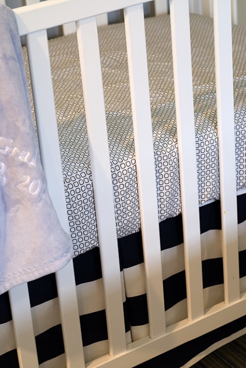
The bold blue stripes (love the horizontal) on J’s headboard is repeated in G’s crib skirt.


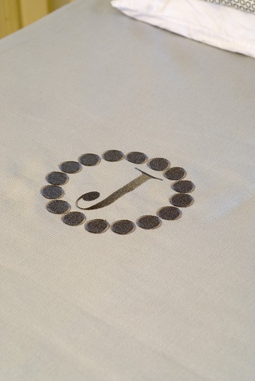
The embroidered initial is an easy way to personalized each boy’s space yet maintain a consistent aesthetic. This will be even more important once G graduates to a “big boy” bed.


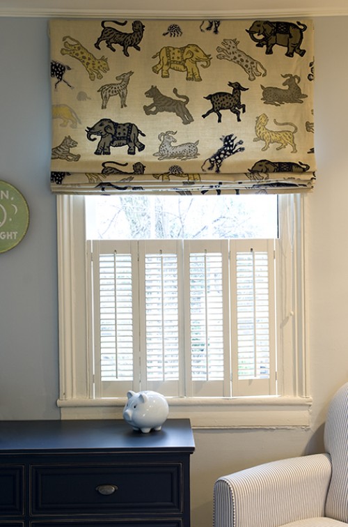
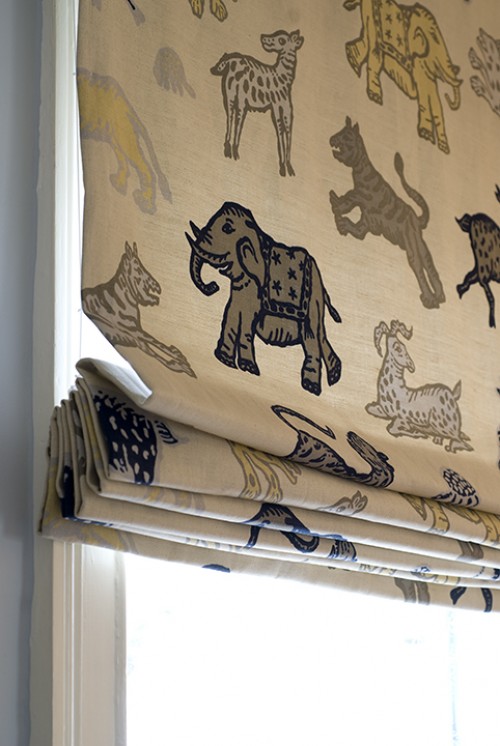
The fabric for the Roman shades. No words. Love the motif, the colors, everything.


Seriously, if you were a little boy, wouldn’t you just imagine the greatest stories about adventures with those tigers and elephants?


Share