Inspiration for the little boy’s room in the DC Design House

But first, a quick introduction. I’m Madelyn. I’m not a designer, but I got to play one at the 2012 DC Design House and it was great. Nancy and I have worked together over the past five years, since I was pregnant with my first and she did my nursery in house #1. Two more kids and two houses later, we’ve done several more rooms together (more on these later).
But I’m a PR/marketing person by trade and over the years I’ve encouraged — ok, maybe bullied, but nicely — Nancy to more actively promote herself and the unique perspective Finnian’s Moon Interiors brings to design. So, with the great Erika of Small Shop blog fame, we’ve updated her brand, created this website and started this blog.
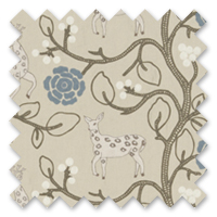
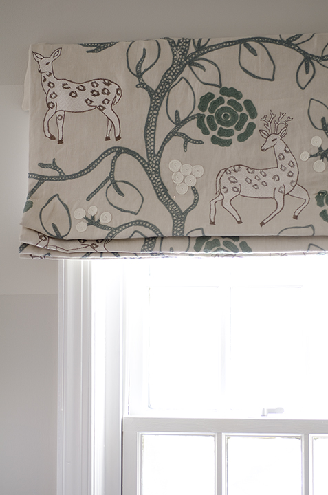
I know Nancy’s business pretty well and I love, love, love playing with fabric memos. When it came time for her to submit a board for the 2012 DC Design House, I knew which of her latest fabric obsessions would be the first swatch pinned:

It is SO Nancy: linen, check; elements of dusty blue, check; whimsical yet sophisticated, check and check.
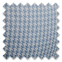
Nancy loves to use apparel-ish fabrics and this room is no exception, as she so elegantly described in the design house program:
The fine woolen houndstooth bolster is like an exquisite scarf worn proudly by grandfathers and grandsons alike.

Sweet, right? I believe that elements in a room resonate with people on deeper levels than they realize; artfully curating these elements is how you make a house a home. Anyway, this fabric, it’s amazing; the swatch image does not do it justice. The “hand” of this fabric alone is reason to visit the DC Design House.
But we knew we wanted a hit of modern balance that traditional feel and to enliven the space, and what could be more of-the-moment than a bold chevron?

The fun part was deciding which fabrics would go where. We knew the deer fabric would be Roman shades, so that was easy.

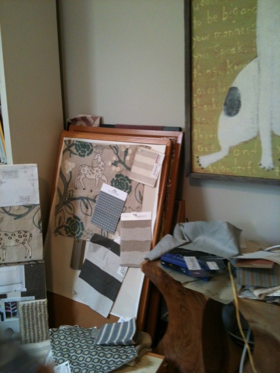
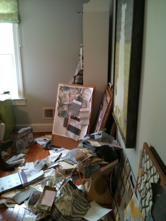
But the rest… Well, we had multiple boards going. And made a big mess of the workroom. We wrestled with the bedding — is this linen too yellow? (it was.), is this stripe too bold? (yep.) — and the chair and ottoman fabrics, what to upholster where?

Creativity is messy.

OK, REALLY messy.
The other thing to consider, accommodating Nancy’s other obsession: a fully upholstered bed, legs and all. Holy cow did that bed turn out well. Horizontal stripes on a leg? Downright Seuss-ian. So fun.
The room, while small, was fairly well proportioned, but we were concerned that a twin bed would look diminutive on the expanse of wall between the small-ish windows. Were this a girl’s room, a daybed would have been the logical approach, like Susan Nelson did across the hall in the very sweet teenaged girl’s space. But no, a day bed would not do for our boy.
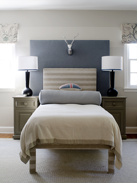
That’s when it hit us. We knew we wanted to fill that wide wall void with fabric so the eye traveled smoothly from window to window, and we knew it would make no sense for a little boy to have a queen-sized bed….but who says we couldn’t give him TWO headboards?! One for now, sweet, whimsical stripes on a right-size twin, and one for later, and more subdued yet still texturally compelling light slate blue queen-sized headboard. Layered! Oh, the visual interest! The practicality! We were giddy. And the details on that queen headboard, grosgrain and nail heads, that match the ottoman? Please. Love.


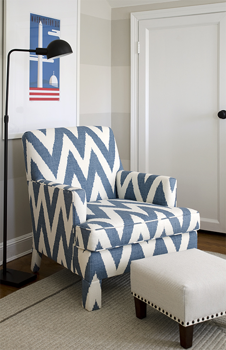
The chevron on the chair, I was hesitant. But Nancy, the expert, knew it would be awesome and boy was she right. Note the upholstered leg obsession carries over here.


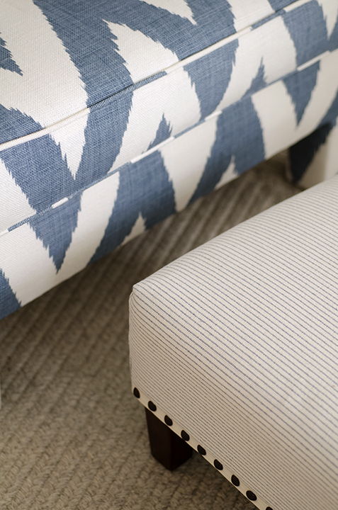
A closer look at the ottoman detailing.
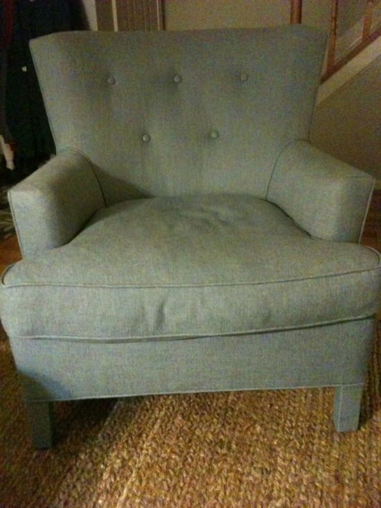
You know how we love upcyling. Looking at it now, it’s hard to believe that that chair was a “vintage” find. That’s our fancy way of saying found in a junk store. Whatever. Added bonus: often times chairs manufactured in the 1950s and 1960s were slightly smaller in scale, thereby making them more comfortable for kids. Score.
Note the fantastic rug in the above picture, a totally modern take on a classic braided rug. It’s 100 percent organic wool, so it can be cleaned, is environmentally friendly and won’t off gas any nasty chemicals (you think about things like this when you specialize in kids + baby rooms). Plus, that gray color hides dirt like it’s its job. It’s been down more than a month and I think we’ve vacuumed once. OK, maybe that’s kind of gross, but it does show just how totally family friendly this rug is. Again, things you think about when designing for kids + baby.
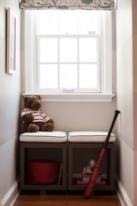
The wall stripes were an on-site, installation development, at first limited to the dormer window nook. Then extended to the bookshelf tree wall. Then it was so perfect Nancy had to do every wall. The key is that the stripes are subtle, really a tone on tone. It adds a ton of interest and is fun, but not FUN. FUN would be too much in a space that needs to inspire a busy boy to wind down.

Nancy designed the cool cubes above. Open for easy toy and book storage, movable for extra seating when friends are over. Much more versatile than a built-in.
From there, it was all about personalizing the space for our little boy. We pegged him at about 4 or 5, so some cute clothes, sports items, some trucks, some teddy bears, and lots and lots of books.
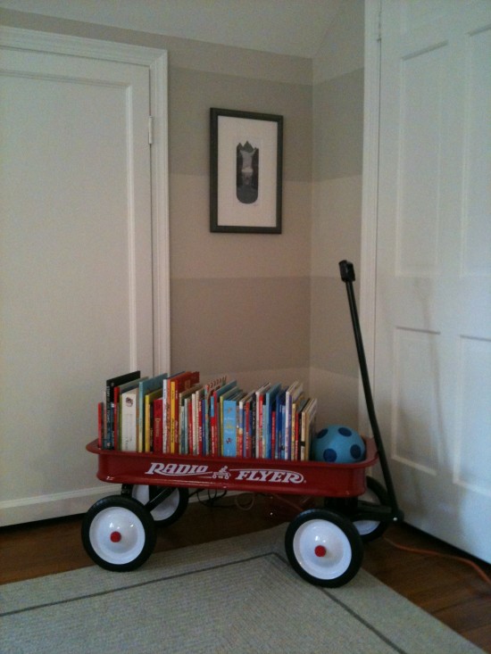
We’ll talk more about shelving ideas in a future post, but between this room’s bookshelf tree and the Radio Flyer wagon-turned-book-shelf, which is at just the right height for our little boy to access and put away himself, you can see that there are tons of fun, creative ways to bring order to the chaos.


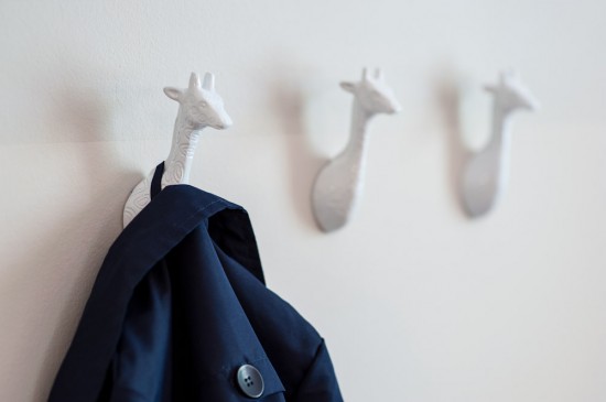
How cute are these giraffe hooks?

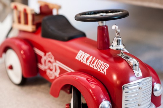
This might be the best firetruck ever.

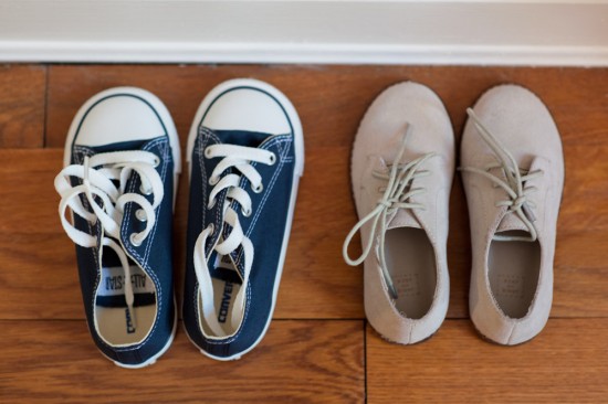
Chucks and bucks. So. Cute.
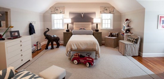
The room was so fun to pull together. It really is worth the trip to see it in person. I’ll leave you with one last look and the official description:

The calm, cool palette of this room provides a solid foundation for those injections of personality that every little boy wants to add to his own space. With a subtle nod to the forest, we’ve included a whimsical tree bookcase to compliment the deer in the window treatment. The comfy lounge chair is a vintage find, brought back to life with fresh upholstery in an oversized chevron. We frequently find inspiration in apparel fabrics and this room is no exception. The wool rug is reminiscent of your favorite cable-knit sweater; the linen duvet is both inviting and forgiving; and the fine woolen houndstooth bolster is like an exquisite scarf worn proudly by grandfathers and grandsons alike. The sophisticated serenity is nudged gently to the side with our whimsical bed. Not just an upholstered headboard, but a fully upholstered platform bed shows off striped legs beneath the duvet. What fun! This is a little boy’s retreat that would delight any young resident and the grown-ups who are allowed in.
LAST CALL! The DC Design House closes this weekend. Come see us!

