Design Concepts
We present!
Based on our meeting with Izzy, we created some “boards” for the girls: bulletin boards with fabric swatches and paint colors pulled together to bring the look of a room to life. For R, we presented three options; for the about-to-be-born baby sister, two.
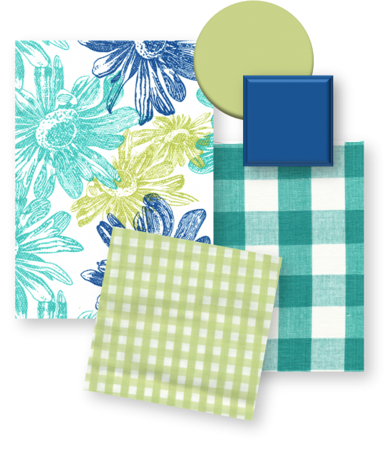
For R this first look is “Bright Florals: Check!” Love the bright turquoise, fresh light green and royal blue. Totally not syrup-y sweet, but still no question that it’s a little girl’s room. The mix of checks is an unexpected design element that’s balanced nicely by the bold floral. The green paint swatch is one of my “go to” wall colors: Glidden’s Floating Lily (see it in our baby portfolio, second photo). The square paint chip is Benjamin Moore’s Blue Nova which we’d use for some of the furniture.
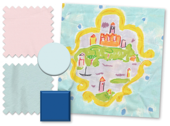
Next option for R is “Castles in the Sky.” Even though Izzy told us that R is not a pink pink pink kind of girl, we felt comfortable including petal linens here because clearly aqua–found in the fabrics and on the walls (Benjamin Moore’s Morning Sky Blue)– is the dominant color story. Add that pop of sunny yellow, splash of green and dash of orange in the castle fabric, and the whole look is far from trending too pastel-y. A royal blue book shelf would further balance the room. It’s whimsical…without being too cutesy.
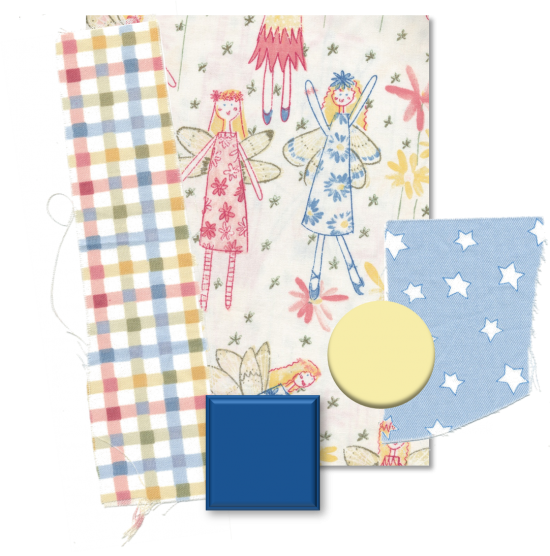
The third option is “Fun Fairies.” So playful. See how you can have a look that’s definitely girly but not the traditional pink-princess-fest? The check and stars are actually pretty gender neutral; partnered with a different fabric these could easily go in a little boy’s room. But here, with the happy little fairies and the smattering of almost hand-drawn-looking floral motif, the look is all girl. For the wall here we suggest Benjamin Moore’s Japser Yellow. It’s a creamy yellow, so it’s sunny but not blinding.
Now for the little one. Here Izzy was thinking “soft” and “old-fashioned” but also said that she likes the idea of pink and green. So we have both options, one that’s more on the trad side, the other goes preppy but with elements that tie to the traditional.
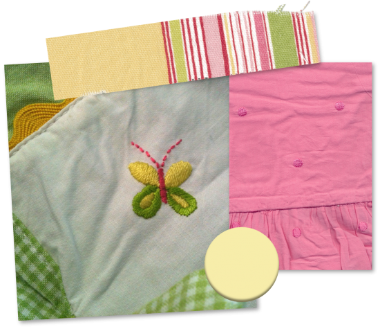
“Bright Butterfly” hits the pink and green, but the gingham, rick-rack and embroidered butterfly in the crib skirt and the embroidered Swiss dot on the hot pink fabric are nice nods to tradition. We like the Japser Yellow paint in this room.
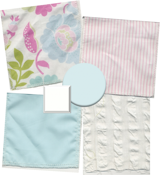
On the sweeter, slightly more old-fashioned side, we presented “Garden: Lovely + Modern.” The pink and white stripe and the aqua linens are so fresh and so pretty, no question traditional and timeless. But it’s the floral that’s the star here. Enlivened by the bright green, hot pink and pops of turquoise, but balanced by the pastels within the pattern, this floral print is the perfect way to bring the modern to the lovely. And the seersucker, there are no words it is so good. Such a breezy, happy fabric. The white wood chip is for the crib, which would pop nicely in front of the Benjamin Moore Morning Sky Blue wall.
So which is your favorite? Which board would you have picked for each girl?
Next in Operation: Decoration
Izzy’s choices revealed, and we fill in all of the design details…

I love the first option “Bright Florals: Check!” — especially since I’ve been on a turquoise and green kick lately.
For the baby, the “Garden: Lovely + Modern” is perfection in my opinion.
But honestly, any of the options would be lovely!